Good Looking Frontiers
You can tell a lot about the population resources you have available to you by looking at the shape of your Frontier. To illustrate this, we will look at an ideal Frontier shape and a less desirable (but sometimes necessary!) Frontier shape.
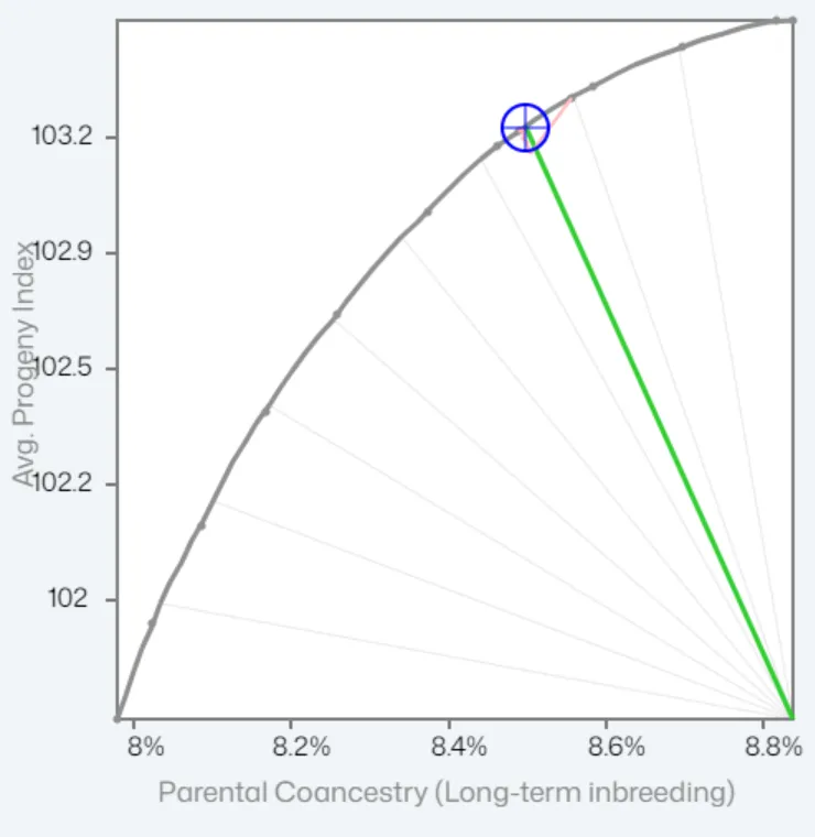
Ideal Frontier Shape
Section titled “Ideal Frontier Shape”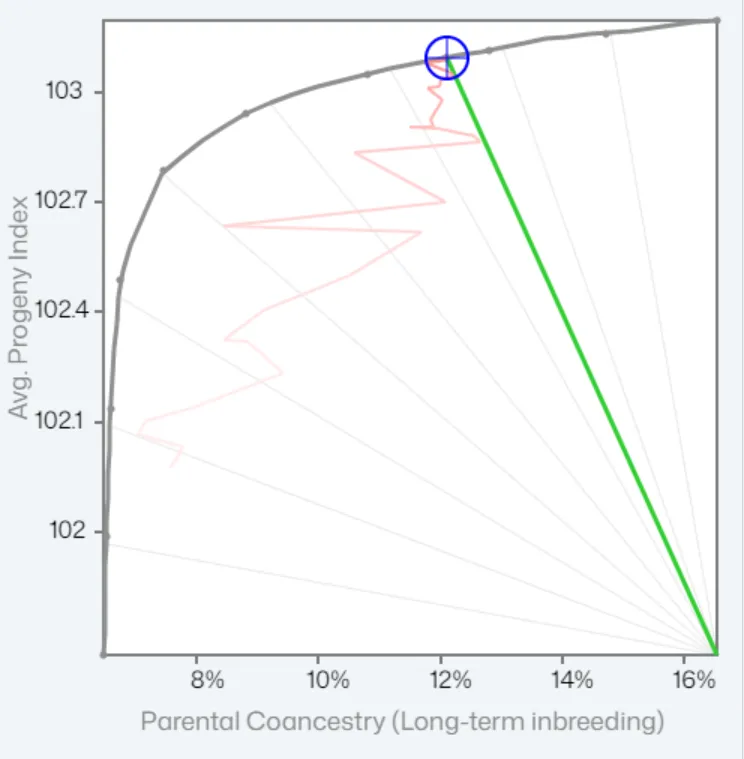
This is a healthy Frontier shape because as you increase genetic diversity, there is minimal impact to Avg Progeny Index. In the example above, increasing diversity from 16% to 10% has only a 0.3 decrease (approx.) in Avg Progeny Index.
Less Desirable Frontier Shape
Section titled “Less Desirable Frontier Shape”Before we look at this Frontier shape, it is important to state that many breeding programs show similar, less desirable frontier shapes for several reasons. This does not indicate poor management; instead, it reflects the population resources available at the time. The frontier graph can help programs recognise when there is a need to import new genetic material or improve inbreeding management, especially in closed populations.
This is a less desirable Frontier shape because as you increase genetic diversity, Avg Progeny Index “dives” quite quickly. This is typical where there is one legacy sire, and the next best candidates are his sons: We have to move out of that high-merit family line to get new diversity.